Digital Covers
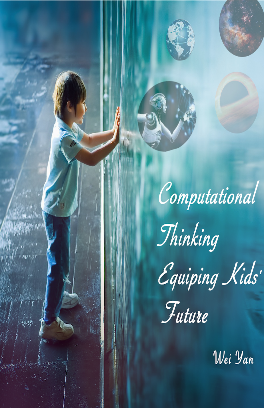
The book cover is related to K-12 computer science education. As we knew, studying computer science has brought the world more emerging technologies. Since Wing (2006) promoted the computational thinking, K-12 computer science has grown rapidly. This book will introduce the basic CT concepts and how to prepare and develop kids’ computational thinking from a young age. The design elements included kids, codes, robots, artifact intelligent, earth, solar system, and galaxy. The design rationale was that the kid immersed in the programming environment was going to open a new world for him. I selected the robot and AI world as a translation to the future exploration for kids. After the kid open the door, he/she would see more possibility and ample new things. There were six images for this digital book cover. One image used as background and five images embedded in the background to create the montage. The book tittle was “Computational thinking equipping kids’ future”, which was my beliefs and academic dedication. The bitmap was created by GIMP 2.0. Picture resources were attached below. During the process, I cut images, and used the function of alpha channel, made lots of layers, and changed some colors and opacity to make them more pretty and professional. All colors chose for the design was based on the color theory.
Bitmap
Vector

Logo
This logo was created by Adobe Illustrator 2021. It was a vector image, which can help the logo more simple, creative, and clearly. It included the abbreviation of computational thinking. The orange color represented Computational while the blue line combined with the C represented the Thinking. Reason that I called it identity logo was that I put my abbreviation of my first name, W, in the logo. The “W” was drawn by “CT & future”. The color of C and T made it more contract and stand out. Since I didn’t want the “w” covered CT, I used the black color. The whole of the logo was also like a person who was walking on the way. I hoped learners could an active learners while in the process of seeking knowledge.